Designing Effective and Visually Compelling Bar Charts
In the world of financial and data analysis, a picture is worth a thousand words. The charts you choose may be the only thing your audience looks at. It's essential to make them as informative and compelling as possible. Your chart should tell your story for you.
The Art of Choosing the Right Chart
Before you start designing your bar chart, take a moment to consider the story you want to tell. Is a bar chart the best way to convey your message? Remember, bar charts excel at showing differences between categories, making them ideal for comparing values. If that fits your story, then a bar chart is the perfect choice. if it isn’t, you may want to look elsewhere.
Bar charts are some of the simplest charts to create. However, they are a great starting point to learn the principles of effective data visualization. Below, we'll explore how to create bar charts that tell a story and captivate your audience.
Breathing Life into Your Bar Chart
Now that you've chosen a bar chart, it's time to bring it to life. Let's start with a basic chart created by Excel and move through a series of changes and refinements:
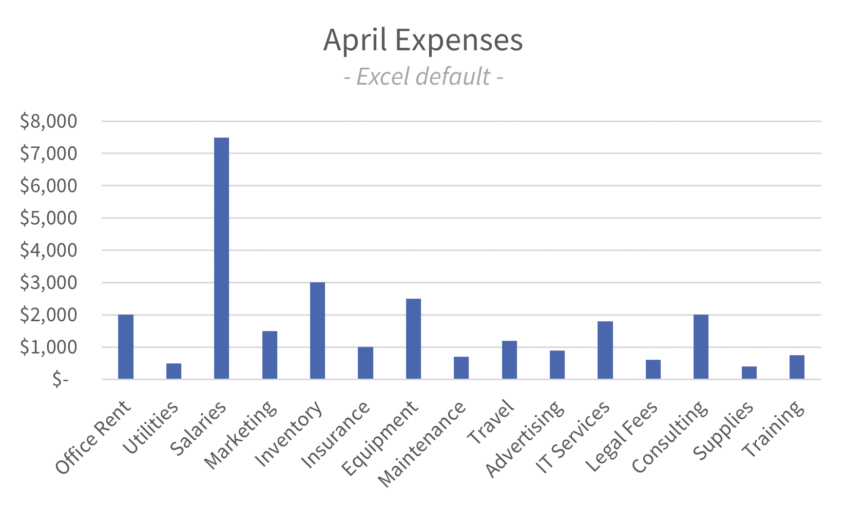
Here is a simple bar chart showing expenses for the month of April across 15 different categories a business might incur.
Clarify and Strengthen Your Chart
Sort your data
If you take one thing from reading this post, let it be this: sort your bar charts. As we discussed above, the purpose of a bar chart is compare values across categories. The easiest way to help your viewer do this is to sort your categories by value.
Whether you sort from largest-to-smallest or smallest-to-largest will depend on your data and the story you want to tell. Generally, you will want your most ‘important’ items on the left of your data as a viewers eye will instinctively move from left-to-right. What exactly “important” means will depend on your data and your story.

In this example, we've sorted the data from largest to smallest expenses. Here, the largest expenses are the most important.
Refine Your Axis
Next, let's focus on the y-axis. By default, Excel has made things rather cluttered. Setting our unit scale to ‘Thousands’ and reducing the number of gridlines makes your chart cleaner and more focused on the data.
The clearest charts are the ones which tell your story with as few added features as possible. If you think about a printed version of your chart, your goal should be to provide the most information possible with the least amount of ink.

Removing visual clutter allows our audience to focus on the data.
Broaden your data bars
Make your bars broader and more prominent. This will focus attention on the data and reduce the portion of your chart that is not conveying information

With broader bars, data points are easier to compare. You could opt for broader bars. That said, I want a bit of whitespace on the chart.
Adding a Touch of Style to Your Bar Chart
Creating a visually appealing bar chart is part art, part science. From here on, personal preference places an increasingly important role. I can’t tell you what looks good for you and your audience.
The expectations of your audience are key here. Your viewers should not have to ‘learn’ the visual language of each chart you build or struggle to interpret your information. Additionally, they shouldn’t be surprised by your design choices.
Gradient filling for bars
To me, a gradient adds a sense of motion and visual variety that I find deeply appealing. It is almost as though the bars are growing to their respective heights. Additionally, the gradient here does not reduce the information present in the chart, just the amount of ink required to convey that information.
That said, this is a more aggressive styling approach that may raise some eyebrows depending on your audience.

The gradient adds depth and draws the eye to the top portion of the bars, where the most important information lies.
Lighten or remove gridlines
Lighten gridlines or consider removing them entirely for a clean, minimalist look. Either option will reduce distractions and keep the focus on your data.
Removing gridlines entirely may be a bit much for some audiences. It’s not right for every circumstance but when it’s right it is so right. In the right circumstances, removing gridlines entirely reduces clutter while maintaining the ability to compare categories and glean information from the chart.

The change here is subtle but seriously helpful. This is almost always a strong bet.

The change here is much more impactful. There is a very minimalist feel to the chart that, for me, is highly appealing. That said, I have had leaders in the past who would have hated this approach.
Last touch: Highlighting the Stars of Your Story
Often, you'll want to draw attention to specific data points to support your narrative. In that case, changing the color of the bar you want to emphasize immediately draws the viewers eye there.
High contrast colors work best. Use color psychology to your advantage (e.g., red for negative, green for positive).
This is an especially helpful tactic if your data is easily lost among other data points. For example, in this chart, I wouldn’t feel a strong need to highlight ‘Salaries’ because I know the viewers eye will immediately go to it as the largest item on the chart.

Here, we use red to draw immediate attention to ‘Office Rent’ as our fourth largest expense category. We could use this chart to build a chase for a shift entirely to remote work.
Final thoughts
Designing effective and visually compelling bar charts is a crucial skill in financial and data analysis. Hopefully this post has given you some ideas about how to refine your designs, add a touch of style, and create bar charts that tell a captivating story.